Monday, May 22, 2017

Vase Fairy


Imagine a fairy hiding, or even living in a decorative vase. What fun if it could be true!
I first decided on the color I wanted my fabric, then I chose all the rest of the colors to go with it.
Decide what color you'd like your fabric to be in this picture, and go from there. I particularly liked leaving a lighter glow around the fairy. Instead of hiding her, I've showcased her, since she's right out on display anyway. There are many different tacks you can take in your coloring and still feel like your picture is a success.

Get this "Magical Fairies & Flowers" coloring book from Amazon.com and color to your heart's desire. Just click on the book to the left of the screen and it will take you to Amazon.


Monday, May 15, 2017

Violin Fairy


I used classic reds and greens in this picture, with touches of blue and yellow, and left the lilies of the valley white for contrast. You could still use greens for background and make the roses your own favorite color. See what fun you can have!


Monday, May 8, 2017

Rose Fairy


This is one of my favorite pictures to color. It can be done in so many different ways. I wish I had put my fairy in blues and yellows instead of blues and purples.  Enjoy shading the roses and choosing fun colors.


Monday, May 1, 2017

Pumpkin Fairy


I made my pumpkin orange-red in this picture, so I could use plain orange inside and create a difference in tone. I could have put my little fairy in some shade of orange as well, but I chose to let her hide in blue among the leaves. You could make the blue flowers bright pink if you wanted them to pop out more--or change all the colors together. What about a purple pumpkin and orange sky? See what you can come up with.


Monday, April 24, 2017

Tiger & Lilies


Since I've already shown the king of the jungle, I needed to feature the dramatic tiger with both day lilies and calla lilies. I used bright flower and jungle colors. Do your own thing and see if you can create a new jungle setting.


Monday, April 17, 2017

Lion Bouquet


I tell my students that I have only one rule: BE NEAT!  Coloring takes a lot of time, and whether the finished product is just as you like the colors or not, if you did a neat job, it won't have been a waste of time. I don't think you can go wrong in this picture if you just do neat work and pick a good color that transitions your lion into the flower stems. Put on a cozy movie, kick your feet up, and color away.

Monday, April 10, 2017

Jewel Box Ballerina and Fairy


This is a busy picture to color. For that reason, I tried to stick to colors that harmonize well, and yet offer some contrast. Enjoy coloring your version!

Monday, April 3, 2017

High Heel and Roses


I closed my eyes and picked out a handful of colors to use in this picture. It's kind of fun to give yourself a challenge like that. If I did this picture again with the same handful of colors, I'm sure I'd do it differently. Using these same colors, how might you change my rendition?  See what you can do.


Monday, March 27, 2017

Gargoyles


These ugly little gargoyles almost look happy nestled inside the flower pattern. Another way to do this picture would be to use a very dark background and lighten and brighten the gargoyles -- especially the flowers. I wish I could see your colored renditions of these pictures.

If you can tell in the reproduction, I usually use two or three different colors or shades in my flowers and leaves


Monday, March 20, 2017

Battenburg Lace Fan


Again, I used dark mysterious jewel tones. If I did it over, I'd lighten my background to show off the fan to better advantage.

I should warn you, since I've learned the hard way, that dark blue pencil colors often give off a lot of dust that tends to muddy the colors around it. Sweeping off the dust with an artist's brush, or blowing it off doesn't prevent the smearing from taking place. I would suggest doing those particular blues first, then using a kneaded eraser to take off what dust you can before you lay in other colors.

Battenburg lace is usually white or ecru, so I took a lot of artistic license using red, blue, and green instead. You can do whatever you like in your pictures. :) Have fun!


Monday, March 13, 2017

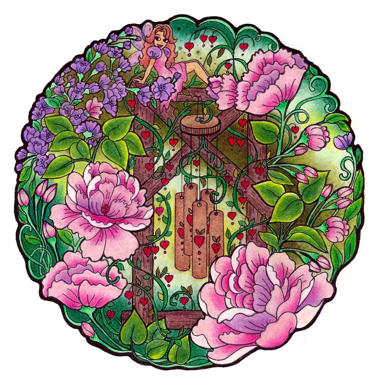
Fairy Chimes

It's easy to imagine fairies being near whenever I hear chimes. I used pinks, lavenders, greens, and browns to hide my fairy. Use your imagination in coloring your own fairy chimes picture. What colors evoke the thought of fairies to you? Do you want your picture light and playful, or dark and mysterious?


Monday, March 6, 2017

Happy Birthday


Happy Birthday to you or to whomever you'd like to send greetings. I used teals, pinks, and burnt yellows--the colors I had on hand at the time I colored this picture. I think more cheerful yellows might brighten it up. The best thing to do with this would be to color it in the favorite colors of your birthday person. Good luck!


Monday, February 27, 2017

Bright Books


I used lots of jewel tones in this picture that remind me of a library, but it could be done in mysterious Americana browns, reds, oranges, and blues. The possibilities are endless. Have fun with your picture.


Monday, February 20, 2017

Brown Bear


Here is a traditionally colored brown bear with a rather smudged little green fairy. Maybe you could brighten her up in your effort. Also, if I did this again, I might make the change from a blue side, to a teal side, more green or yellow-green. This could be done beautifully in reds, oranges, and yellows as well. Enjoy!


Monday, February 13, 2017

Fairy and Birdbath


Colorers tell me they have a hard time choosing colors for their pictures. Well, I'm here to tell you, so do I! But I'm used to the fear, since failure is an artist's common fare.

I'm going to post a series of colored pictures for the next 15 weeks from my "Magical Fairies & Flowers" color book, to help inspire my favorite coloring artists in their color choices. (For better or worse). Even if I don't mess up a picture, I always feel like I could do better if I did it again. Maybe you can build on my efforts and mistakes and do better.

Starting with this . . . Here is a possible way of coloring the fairy and birdbath scene using evening colors because of the early night moon. Enjoy your coloring!


Thursday, November 24, 2016

Celtic Sword & Helmet

Celtic Sword & Helmet  

(from "Celtic-Inspired Snowflakes" by Marie Scott & Dawn Andrus)


PENCILS
I used a mix of colored pencils from Prang, Crayola, and Prismacolor. 

COLORS
For this very Celtic picture, I wanted to use good old English/Scottish colors, so I chose a red and green complementary color pattern, with purple and light blue thrown in for good measure, and browns and tans for practical purposes.

TECHNIQUE
I have to admit I spent most of my time trying to salvage this picture because my color choices kept not working. But I have a rule that I will not scrap a picture once started, because I'm sure I would find myself scrapping every picture for one reason or another and never get anything finished. Artists are never satisfied, and even if they think they're finished after the last sitting, they find things they'd like to do better. This picture was a special problem.  So my technique on this one was to keep hammering away with one color after the other until it was so thick with pigment, it sunk on the page. :)  Still, it comes off looking fairly Old English after all, which is to say, plain and serviceable.  The idea here is to let you know you aren't the only one who struggles--and just hang in there and learn by experience.


Thursday, November 17, 2016

Magnolia

Magnolias  

(from "Flower Snowflakes" by Marie Scott & Dawn Andrus)


PENCILS
I used Crayola and Berol Prismacolor pencils, and smoothed them with petroleum jelly.

COLORS
This is a gorgeous Magnolia design, and I had to do it in the pinks and greens I love most. It is a fairly straight forward complementary color scheme, with touches of yellow, lavender, and light teal.

TECHNIQUE
The pinks and dark pinks I laid in with crayola colored pencils. Then I added vibrant Berol Prismacolor colors on top and smoothed it all with petroleum jelly. This can make for very dramatic color. Then I worked in touches of yellow and lavender on the petal edges. I also used a mix of two greens on the leaves, then added teal blue to the stems and leaf centers. I just love to put in as many touches of different color as I can, even in the dark pinks of the border.  After the picture was done, I scanned it into a photo shop program and flood-filled a light teal border as a cool contrast.


Thursday, November 10, 2016

Iris Snowflake

Iris Snowflake  

(from "Flower Snowflakes" by Marie Scott & Dawn Andrus)


PENCILS
I used both Berol Prismacolor and Crayola colored pencils to color this picture. 

COLORS
I chose to mix together four different iris colors in each bloom, instead of coloring the flowers each a different color. It serves to make a pattern of lower reddish petals and upper blueish petals. My colors are red-violet, blue, violet, and blue-violet, with varying greens and touches of yellow and orange. It's particularly fun to stick a little orange alongside the long green leaves as a contrast of vibrancy

TECHNIQUE
This was all colored and shaded using the bright softer pencils of the Berol Prismacolor first, and then I burnished each color with a similarly colored Crayola colored pencil. It made for some vibrant color worked into the paper's tooth.


Thursday, November 3, 2016

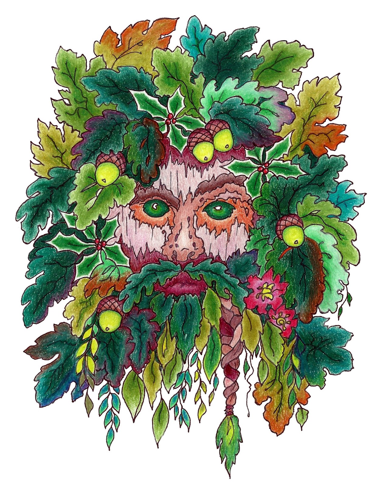
Green Man

Green Man  (from "Celtic-Inspired Snowflakes" by Marie Scott & Dawn Andrus)


PENCILS
I used mostly Berol Prismacolor pencils in this picture. They are a higher and softer grade of pencil that give great vibrancy of color, and layer well.

COLOR CHOICES
I wanted to do this picture mostly in forest colors rather than fall colors, but I worked in some fall colors simply because I love color. You could call this a kind of neighboring color scheme,(colors beside each other on the color wheel. Greens and neutral browns.), but because of the reds you could also call it a complementary color scheme, (colors across each other on the color wheel. Red & green). I used many colors of green: some layered with blue, some layered with orange or red, and some layered with yellow.

TECHNIQUE
I laid color down in layers, sometimes burnishing with a white pencil in between layers, sometimes not. I also shaded mostly by fading into different colors rather than by shading with one color. That's achieved by shading with one color, then layering with the next being careful to grade in the color gradually. Fun stuff!


Friday, October 28, 2016

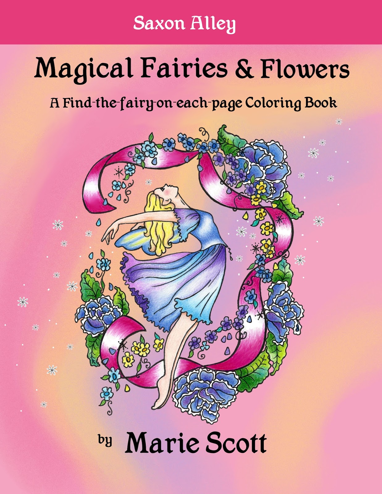
INTRODUCING OUR NEWEST COLOR BOOK!

"Magical Fairies & Flowers:  

A Find-the-fairy-on-each-page Coloring Book"

We are excited to introduce this new adult coloring book, also wonderful for ambitious children.

The back cover gives you a taste of what the pictures are like. Each one of the 42 designs is carefully hand-drawn, (none of that cheap and common computer generated artwork), and includes a fairy to find in each picture.

   It's for sale on Amazon.com for $9.99 right now.

 We hope you'll love it!


Here are some of the pictures colored.