Celtic Sword & Helmet
(from "Celtic-Inspired Snowflakes" by Marie Scott & Dawn Andrus)

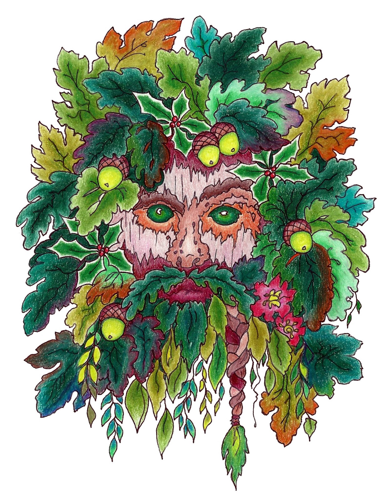
PENCILS
I used a mix of colored pencils from Prang, Crayola, and Prismacolor.
COLORS
For this very Celtic picture, I wanted to use good old English/Scottish colors, so I chose a red and green complementary color pattern, with purple and light blue thrown in for good measure, and browns and tans for practical purposes.
TECHNIQUE
I have to admit I spent most of my time trying to salvage this picture because my color choices kept not working. But I have a rule that I will not scrap a picture once started, because I'm sure I would find myself scrapping every picture for one reason or another and never get anything finished. Artists are never satisfied, and even if they think they're finished after the last sitting, they find things they'd like to do better. This picture was a special problem. So my technique on this one was to keep hammering away with one color after the other until it was so thick with pigment, it sunk on the page. :) Still, it comes off looking fairly Old English after all, which is to say, plain and serviceable. The idea here is to let you know you aren't the only one who struggles--and just hang in there and learn by experience.